IOC Olympics App
Work IOC Olympics App

Olympics App — from news feed to Olympic experience

Client
IOC — International Olympic Committee
Role
Senior Product Designer
Timeline
Nov 2024 – Present
Scope
UX · UI · Design System · Strategy
110M
People reached — app + website, Milano Cortina 2026
2
Design systems built from scratch — app & web
20+
New user flows designed as part of the improvement scope
"The old approach: put everything everywhere. The new one: give every piece of content its right place."

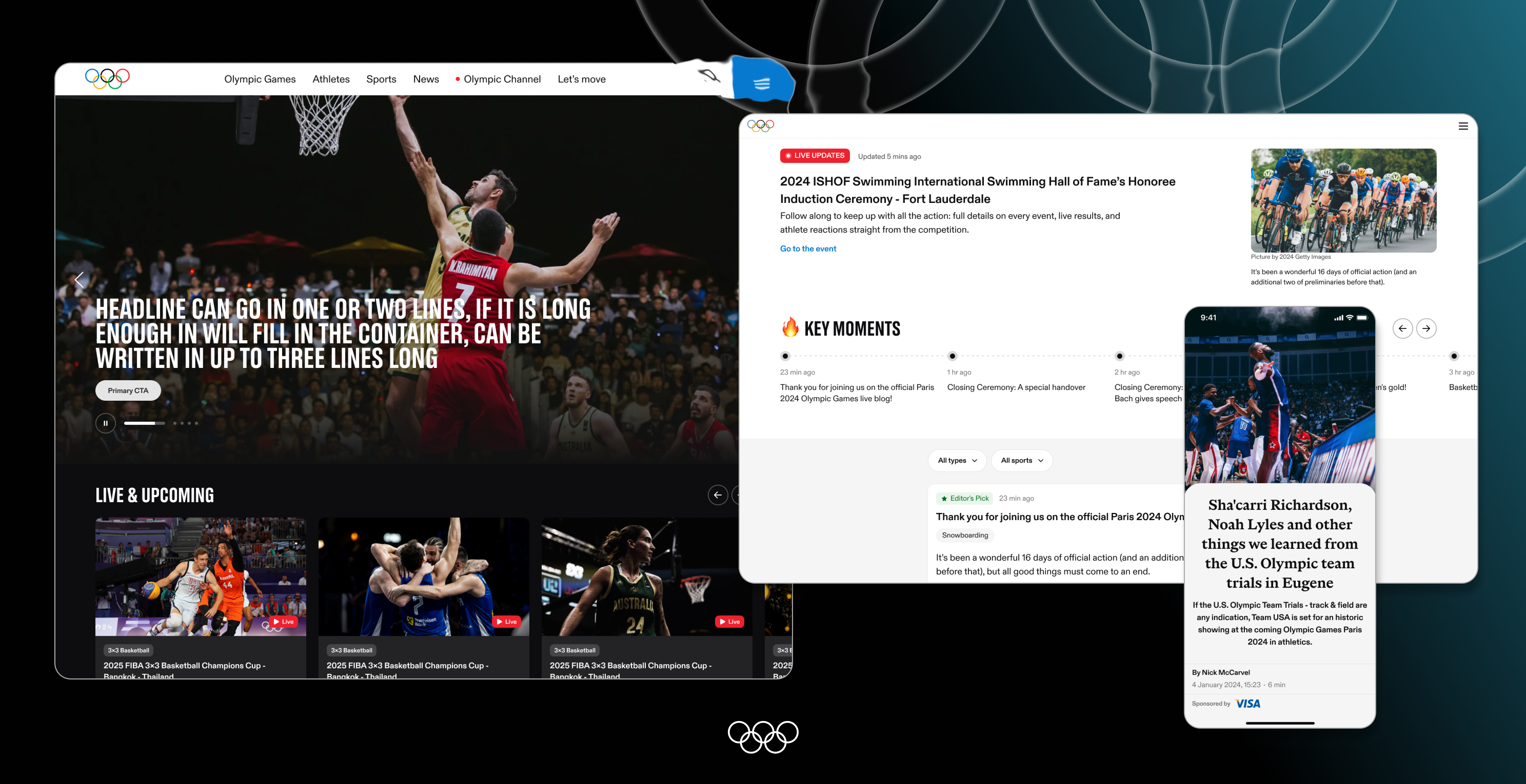
The Olympics app had accumulated years of features without a clear information hierarchy. Content was duplicated across sections, personalization was non-existent, and the homepage tried to do too much at once. The challenge was not to add more — it was to make sense of what was already there, and design for what users actually needed.

On top of that: a highly political environment with dozens of sponsors, international committees, and stakeholders all with a seat at the table.

Before → After

BEFORE
Content everywhere at once
Homepage tried to surface all sections simultaneously — news, videos, schedules, athletes, results. No hierarchy.
Heavy duplication
Same content appeared in multiple places. No single source of truth for the user.
Zero personalization
Every user saw the same thing. No feed tailored to interests, sports, or athletes.
Passive experience
Read, watch, leave. No interaction, no engagement, no reason to return.
AFTER
Redesigned homepage
Clear hierarchy, focused sections, content given its right context and place. Less noise, more signal.
New Feed page
A dedicated, personalized stream — content surfaced based on user preferences, followed sports, and athletes.
Personalization at the core
The product now knows who you follow. Your interests shape what you see — across homepage, feed, and notifications.
Polls & Trivia
Fans can now participate — not just consume. Event-tied polls and Olympic trivia woven into the content experience.

Homepage · Podcast · Feed

01 — Homepage
Full redesign — from cluttered to focused
Before
  • Everything surfaced at once, no hierarchy
  • Same content duplicated across sections
  • Zero personalization — every user saw the same page
After
  • Clear sections, each content type in its right place
  • Personalized based on sports and athletes you follow
  • Less noise — more signal
BEFORE
Homepage before
scroll to explore
AFTER
Homepage after
scroll to explore
02 — Podcast
From text list to visual content hub

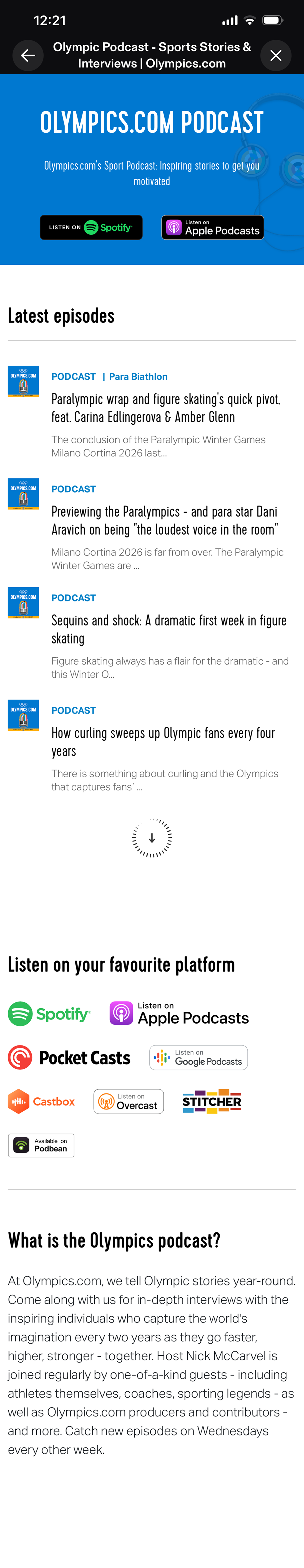
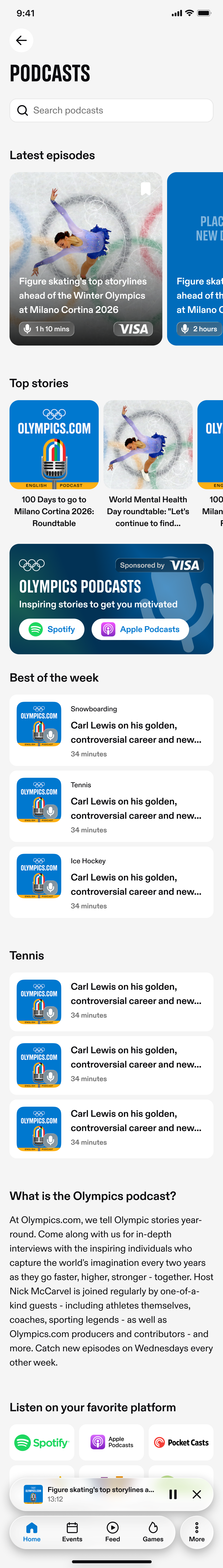
The podcast page is one example of a wider pattern — the app had accumulated many content pages in this same outdated format. Dense text lists, no visual hierarchy, no way to browse by topic. The redesign addressed this format across the board, making content easier to discover and consume throughout the app.

Before
  • Plain text list — hard to scan, no visual cues
  • No way to discover content by topic or sport
After
  • Visual-first layout — hero episode, top stories, topics
  • Content grouped by sport and relevance
  • Easier to find what you actually want to listen to
BEFORE
Podcast before
scroll to explore
AFTER
Podcast after
scroll to explore
Feed — new page
scroll to explore
NEW PAGE
03 — Feed
Built from scratch — didn't exist before
  • Personalized stream of content based on who you follow
  • Mixed format — articles, videos, podcasts, highlights in one place
  • Masonry grid adapts to content type and length
  • A reason to open the app every day, not just during events

Engagement mechanics shipped

The visual overhaul was one layer. Underneath it, we rethought how users interact with Olympic content — moving from passive consumption toward active participation.

PARTICIPATION
Quizzes & Polls

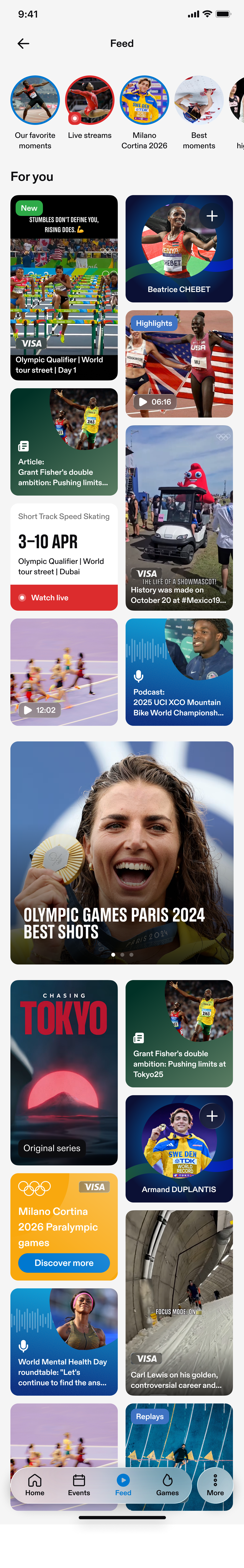
Interactive moments tied to live events — predict outcomes before, react after. Surfaced contextually in the homepage and feed, not as a standalone feature.

ACCESS MODEL
Guest vs Registered

Guests browse freely. Registered users unlock personalization, polls, and persistent favorites. Registration becomes a value exchange — not a barrier.

PERSONALIZATION · IN PROGRESS
Favorites as relevance engine

Favorites no longer just save content — they shape what appears in the feed and homepage. The foundation of personalization, currently being rolled out.

Strategy · Roadmap · Design · Systems

This is not a project where I executed someone else's vision. The product direction, improvement proposals, roadmap priorities, and all design output are mine. My PM approves — the thinking comes from me.

Product strategy
Direction & roadmap
Identified the core problem, proposed the engagement direction, defined priorities — including the shift from passive consumption to active participation.
Full app redesign
Every screen, every flow
Homepage, feed, podcast, article, engagement features — 20+ user flows redesigned across the entire app.
Design systems
2 built from scratch
Separate systems for app and web — full component libraries, tokens, documentation, and handoff specs.
Stakeholder alignment
Complex environment
Navigating sponsors, international committees, and political constraints — advocating for user experience at every step.

Designing at the intersection of sport, politics, and brand

POLITICAL COMPLEXITY

The Olympics is one of the most politically sensitive global products. Every design decision touches on representation, neutrality, and international relations. Learning to navigate this — and design within it — was a project in itself.

SPONSOR ECOSYSTEM

Dozens of global sponsors, each with visibility requirements and brand guidelines. Balancing their presence against a clean user experience — without any single sponsor dominating — required constant negotiation and system thinking.

EXTREME SCALE

110 million users in two weeks. No gradual rollout, no room to iterate post-launch. Every flow, every edge case, every error state had to be right before the Games began — at a scale where small mistakes become global issues.

ONE PRODUCT, EVERY AUDIENCE

From a casual viewer watching athletics once every four years to a dedicated fan who follows every athlete by name — the same interface has to work for both. Designing for breadth without losing depth was a constant balance.

Next project
Allyz Assist — Insurance Platform